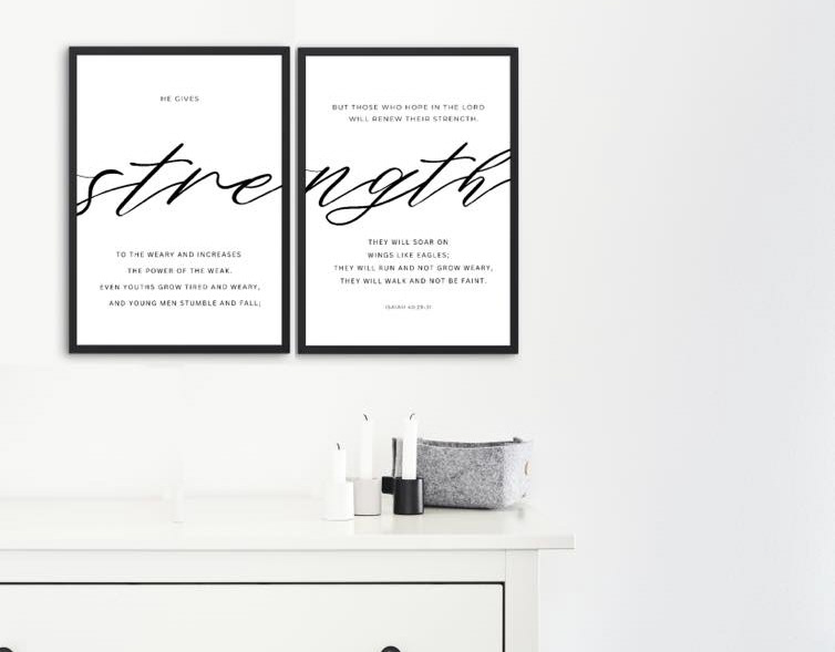
Typography selection refers to the process of choosing and arranging typefaces (fonts) for written content in a design, whether it's for a website, print material, or any other visual communication. It involves selecting the appropriate fonts, styles, sizes, and spacing to convey a message effectively and enhance the overall design.
Key aspects of typography selection include:
Typefaces: Choosing the right typefaces is crucial. Different typefaces have distinct personalities and convey different feelings. For example, a serif font might project a more traditional and formal image, while a sans-serif font can give a modern and clean impression.
Font Styles: Within a typeface, there are often various styles, such as regular, bold, italic, and more. The choice of style can impact readability and emphasis within the text.
Font Sizes: Determining the appropriate font sizes for different elements ensures readability and hierarchy in the content. Headings, subheadings, and body text may require different font sizes for optimal legibility and visual appeal.
Line Spacing (Leading): Adjusting the spacing between lines of text, known as leading, is important for readability. Proper leading prevents text from feeling cramped or scattered.
Letter Spacing (Tracking and Kerning): Tracking refers to the overall spacing between letters, while kerning adjusts the spacing between specific pairs of letters. Fine-tuning letter spacing contributes to the overall aesthetic and readability.
Hierarchy: Establishing a clear hierarchy in typography helps guide the reader through the content. Headings, subheadings, and body text should have distinct styles and sizes to indicate their importance.
Consistency: Maintaining consistency in typography across a design or brand ensures a cohesive and professional look. Consistent use of fonts and styles helps establish a visual identity.
Context: Consider the context and purpose of the design. The typography should align with the brand's personality and the overall message being communicated.
Typography selection plays a significant role in shaping the visual identity of a design or brand. It not only influences the aesthetic appeal but also affects the reader's experience and comprehension of the content. A thoughtful and well-executed typography selection enhances the overall effectiveness of a design.
Why is it important?
Typography selection is important for several reasons:
Communication of Brand Identity: The choice of fonts and their styles contributes to the overall visual representation of a brand. Consistent typography helps establish and reinforce brand identity, making it instantly recognizable.
Readability and Legibility: The right typography enhances the readability and legibility of written content. Proper font sizes, line spacing, and letter spacing contribute to an optimal reading experience, ensuring that users can easily consume the information.
Aesthetic Appeal: Typography significantly influences the visual appeal of a design. Thoughtful font choices and arrangements contribute to the overall aesthetics, creating a pleasing and engaging visual experience.
Establishment of Hierarchy: Differentiating between headings, subheadings, and body text through variations in font size, style, and weight establishes a clear hierarchy. This hierarchy guides the reader through the content and emphasizes key information.
Emotional Impact: Fonts have unique personalities and can evoke specific emotions. Whether conveying professionalism, playfulness, formality, or modernity, the right typography sets the tone for the overall message.
Consistency Across Platforms: Consistent typography across various platforms, such as websites, print materials, and social media, helps in building a cohesive and recognizable brand presence. It ensures a uniform visual identity that resonates with the audience.
User Experience: Typography significantly contributes to the overall user experience. A well-chosen and well-implemented typography selection makes content more accessible and enjoyable for users.
Differentiation from Competitors: Unique and thoughtful typography choices can help a brand or design stand out from competitors. It adds a distinctive touch that sets the brand apart in a crowded marketplace.
Accessibility: Considerations for accessibility, such as choosing readable fonts and appropriate sizes, are essential. Good typography ensures that content is accessible to individuals with varying visual abilities.
Professionalism: A well-executed typography selection reflects attention to detail and professionalism. It communicates that care and thought have been put into the design and presentation of content.
In essence, typography is a powerful design element that goes beyond just selecting fonts. It serves as a visual language that communicates the brand's personality, enhances the user experience, and contributes to the overall success and effectiveness of a design or communication piece.


