By having multiple versions of your logo, you can ensure a consistent look across all platforms and media. This flexibility allows you to adapt your branding effortlessly to different formats and sizes, avoiding distortion or stretching. In this post, we'll explore the most common logo variations, their definitions, and effective usage strategies.
What is a logo variation?
A logo variation is a modified version of your primary logo, designed to fit specific contexts while maintaining brand recognition. These variations offer flexibility in your content and marketing materials, ensuring your brand remains consistent and adaptable across different platforms and applications. Explore the following examples of logo variations.
Why you need logo variations
A comprehensive brand kit should include various logo variations to accommodate different formats and available space. Consistency is key; each variation should align with your overall brand identity. Here are essential logo variations for your brand kit and their recommended uses.
1. Primary Logo
Your primary logo is the cornerstone of your brand identity. It should be prominently displayed on most of your marketing materials to ensure maximum visibility and recognition.
Key Placement Areas:
Website: Use it as the primary element in your website header.
Storefront Signs: Make it a focal point on your physical storefront.
Marketing Materials: Incorporate it into business cards, brochures, flyers, and other printed materials.
2. Secondary Logo
Your secondary logo is a variation of your primary logo. It often has a different orientation, like being vertical if your primary logo is horizontal. This is useful when your primary logo might not fit or be clear in smaller spaces.
Here are some effective ways to use it:
Social Media: Incorporate your secondary logo into profile pictures, cover photos, or as a watermark on posts.
Business Cards: Use it as a subtle element on business cards to reinforce your brand identity.
Invoices and Stationery: Include it on invoices, letterheads, and other official documents.
3. Brandmark(s)
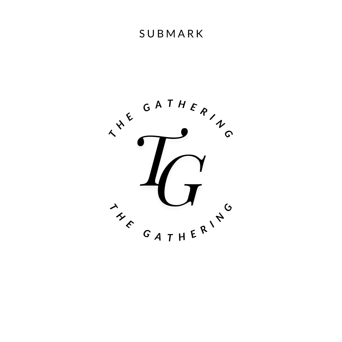
Your submark is a simplified version of your logo. It's often small and compact, like a stamp. It typically includes your business name but not your tagline.
Here are some effective ways to incorporate it:
Social Media: Use your submark as profile pictures, Instagram highlight covers, or a watermark on posts.
Websites: Add it to your website footer or mobile header for subtle branding.
Email: Include it in your email footer to reinforce your brand identity.
Print: Incorporate it into small print assets like business cards, brochures, or handouts.
Digital: Use it on internal pages of workbooks, opt-in PDFs, or webinar slides.
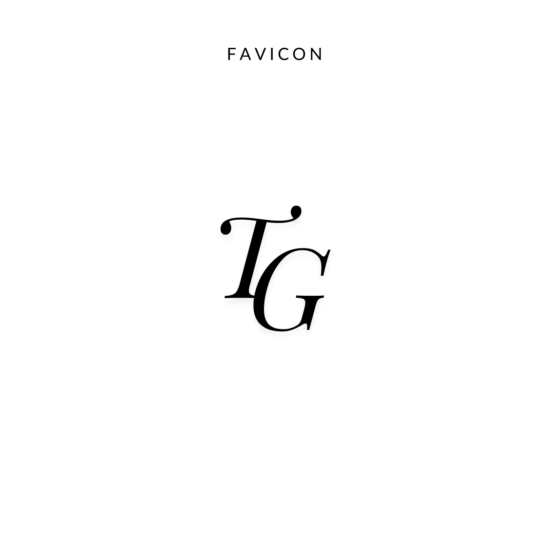
4. Favicon
If your logo includes an icon, consider using it as a standalone brand element. You can also use the first letter or initials of your company name if you don't have an icon.
Here's how to use them effectively:
Pattern Creation: Create unique patterns using your custom icons to add a visual element to your brand.
Digital Platforms: Incorporate icons into your website design, social media posts, and email marketing.
Print Materials: Include icons on business cards, brochures, and other printed materials.
Subtle Branding: Use icons as subtle branding elements in graphics that complement your full logo.
Favicons: Use your icon as a favicon to make your brand instantly recognizable in browser tabs.
Instagram: Incorporate icons into Instagram highlight covers, bullet points, and story graphics.
Marketing Materials: Place icons strategically within your marketing materials to guide the viewer's eye and reinforce key messages.
Other Examples


