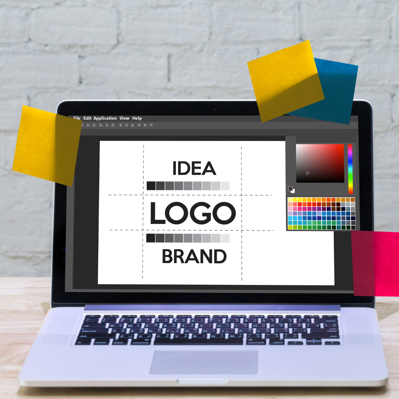
Color is one of the most important elements of a logo. It can evoke emotions, create associations, and influence how people perceive your brand.
When choosing colors for your logo, it's important to consider the psychology of color. Different colors have different meanings and associations, and they can have a big impact on how people perceive your brand.
For example, red is often associated with passion, excitement, and danger. It's a good choice for brands that want to convey a sense of urgency or excitement.
Orange is often associated with joy, creativity, and optimism. It's a good choice for brands that want to convey a sense of fun and excitement.
Yellow is often associated with happiness, warmth, and sunshine. It's a good choice for brands that want to convey a sense of positivity and optimism.
Green is often associated with growth, harmony, and nature. It's a good choice for brands that want to convey a sense of trust and reliability.
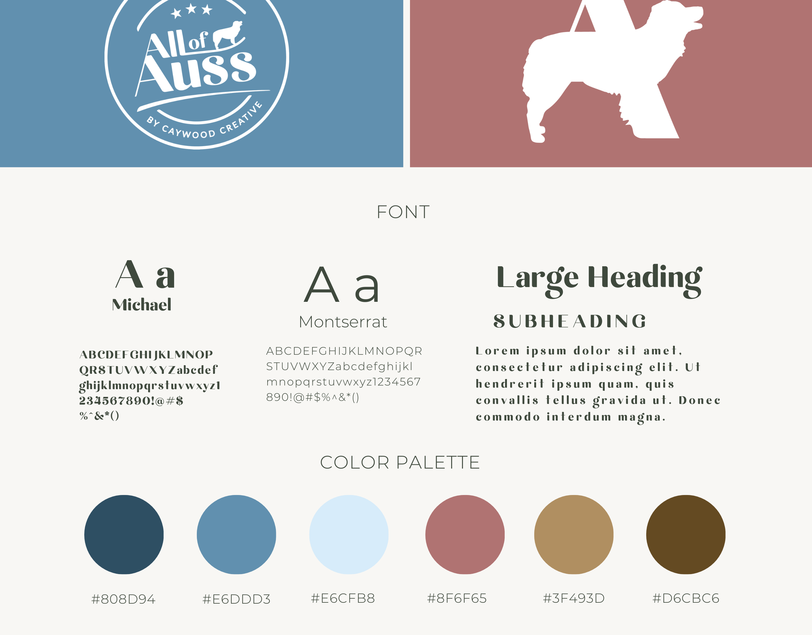
Blue is often associated with intelligence, security, and peace. It's a good choice for brands that want to convey a sense of professionalism and credibility.
Purple is often associated with luxury, sophistication, and creativity. It's a good choice for brands that want to convey a sense of mystery and intrigue.
Black is often associated with power, elegance, and luxury. It's a good choice for brands that want to convey a sense of prestige and exclusivity.
White is often associated with purity, cleanliness, and simplicity. It's a good choice for brands that want to convey a sense of openness and honesty.
When choosing colors for your logo, it's also important to consider your target audience. What colors are they likely to be drawn to? What colors are associated with the industry you're in?
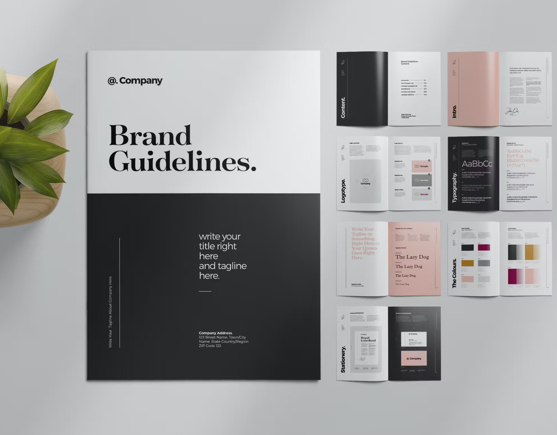
It's also important to use color consistently in all of your marketing materials. This will help to create a cohesive brand identity and make your brand more recognizable.
Here are some tips for using color effectively in your logo design:
· Use two or three colors at most. Too many colors can make your logo look cluttered and unprofessional.
· Choose colors that complement each other. Use a color wheel to help you choose colors that look good together.
· Use color to create contrast. This will help your logo to stand out and be more memorable.
· Use color to create a mood or feeling. Do you want your logo to be fun and playful, or serious and professional? The colors you choose can help to create the desired mood or feeling.
· Test your logo design with different colors. See what colors look best and evoke the desired response from your target audience.
· By using color effectively in your logo design, you can create a logo that is both visually appealing and effective.